Logo Redesign
Client: Child & Family Support Services, a behavioral health company in Arizona
Role: Brand Manager, Rebranding Lead
Tools: Adobe Creative Suite
Overview: As part of a company rebrand, I led the redesign effort for this client’s new logo, which included working with the CEO, COO, CFO, internal marketing staff, consultants, and a few company clients. The company had never taken proactive steps to define what it wanted its logo to look like, the design process revealed different interests, styles, and design preferences.
Goals: A flexible logo design that helps the company stand out from its peers while reflecting the firm’s approach to individual support and treatment: “Look Further. Look Beyond.”


Original
The company was using two different logos when I began the redesign process. It generated significant brand confusion for clients, partners, and competitors.

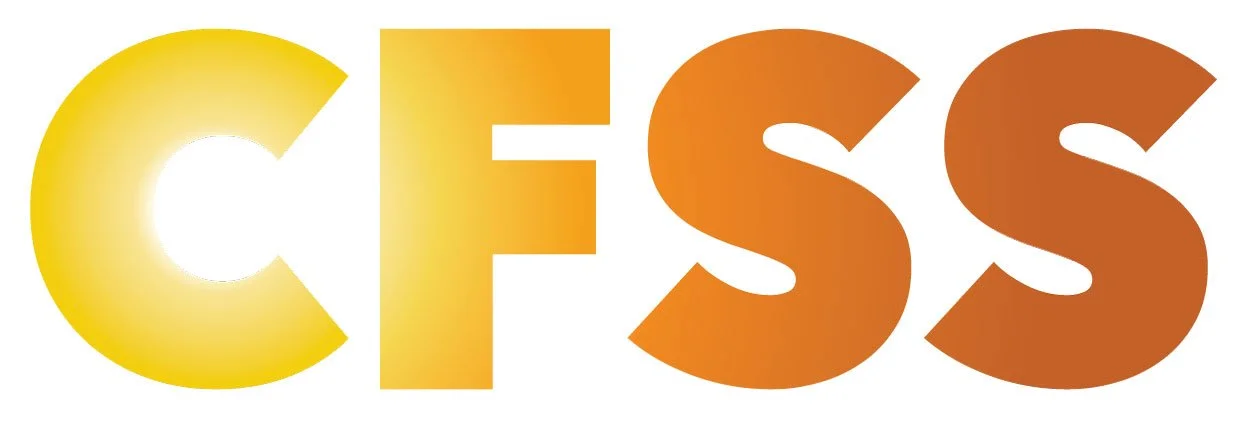
My Suggested Option
After more than 200 revisions, my design team and I arrived at a look and feel that included warm tones, bold typography, round and soft edges, and the look and feel of an Arizona sunrise. Though ultimately rejected for a later iteration, the design below was my preferred option.
Final Design
Ultimately, the company’s leadership team wanted something with metallic, futuristic elements. The final design reflects these preferences.

Redesign Notes
The subtle arrow shape, passing through the letters “C” and “F” and culminating in the arrowhead embedded in the “S,” reflects the firm’s approach to its young clients. Child & Family Support Services takes a personalized, strengths-based approach to help at-risk teens and youth change how they see themselves and find a passion for living their lives.
Instead of seeking to change bad habits, the company’s frontline staff first helps these youth see their strengths and passions and find ways to incorporate those activities and interests to redefine their self-images. As my team and I went through hundreds of iterations, we slowly found design elements, typography, colors, and layouts that reflected these goals better.
Though ultimately my preferred design was rejected in favor of a later design, the ultimate logo represents what the company means to its leadership teams and frontline staff.

Logo Design Variations
A normal logo development process, in my experience, will require between 25 and 50 revisions. The last few revisions represent small, incremental refinements to preferred design styles. However, in this case, the client and its representatives continually changed their design preferences when exposed to different design styles, typography, and colors.
After more than 250 different design iterations, my design team and I finally revealed a style that all stakeholders supported and included elements the client thought were important: metallic effects, “cool” factors such as cut-out letters and a combination of round edges and hard corners.
